
In an appearance on MSNBC in March, Washington Post columnist and obsessed NeverTrumper Jennifer Rubin asserted (more in sorrow than in anger) that more Republicans than Democrats would die from the novel coronavirus because of the unscientific policies (no social distancing, no masks, etc.) of Republican governors and other local officials who were being led, in spirit and example, by that most unscientific of chief executives, Donald Trump.
Rubin’s claim, which she elaborated upon at length at the Post, was risible on its face given the COVID-19 vectors originated in China and Italy and entered the United States through Washington state, California, and New York City and because—especially in the case of New York—the urban density in those locations was highly conducive to contagion.
Nevertheless, Rubin, who seemed more than anything to be blinded by wishful thinking, clearly suggested that the number of deaths in different jurisdictions would serve as evidence of which political leaders were culpable and which ones were not.
In spite of the difficulty in realistically assigning blame for the COVID-19 deaths in the United States, it is nevertheless a talking point in this election season that more than 185,000 Americans are dead and someone must be responsible.
COVID-19 in Blue and Red
We have had a full five months of pandemic hell since Rubin’s provocative pronouncements. So what does the data say?
I have performed a simple calculation to estimate the number of coronavirus deaths of those who voted for Trump and those who voted for Clinton in the 2016 election. (This is distinct from numbers of Republicans and Democrats, of course—but this data is readily available and the Trump/Clinton distinction is, I think, a sensible proxy for Republican/Democrat under the circumstances).
Election data is tabulated by county here. Daily U.S. deaths due to COVID-19 are compiled in the Johns Hopkins University Center for Systems Science and Engineering database (henceforth called the JHU data) again by county. The calculation is simple and it is described in more detail in my webpage AIVoyager.com and, further, the Python code and datasets used are available for download from my github page.
Briefly, I have taken the number of daily deaths as compiled in JHU data and I have multiplied each death in a given county by the fractions of Trump voters, Clinton voters, and voting age nonvoters in that county to obtain the number of Trump voter/Clinton voter/nonvoter deaths on that day in that county. The calculation thus assumes that no deaths occurred for citizens who are ineligible to vote, i.e. under the age of 18.
Figure 1(a) shows clearly that throughout the pandemic Clinton voter mortality exceeds Trump voter mortality, but both are exceeded by mortality among nonvoters. The final totals (as of August 29) are 58,200 Clinton voter deaths, 40,400 Trump voter deaths, and 81,300 nonvoter deaths. The dramatic rise in late April clearly shows the concentration of the disease in the urban northeast—especially New York City. The second wave of the disease is more closely distributed between the two groups with nonvoters continuing to show a larger percentage than both voter groups.
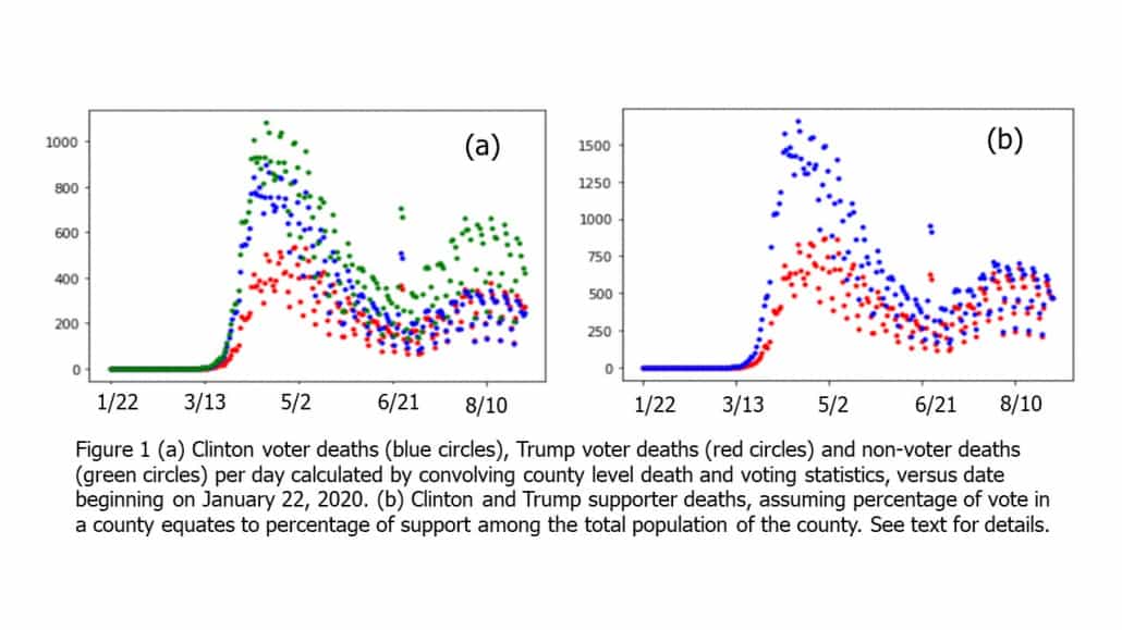
If we assume the vote proportion in a given county is indicative of the overall support for the candidates—even among citizens who did not cast a ballot—then we can calculate the number of deaths of Clinton supporters as compared to Trump supporters. This is shown in figure 1(b), where all the deaths in a given county are attributed to one or the other candidate’s supporters. The absolute numbers are thus higher for each group, but the ratios of the “D” to “R” numbers do not change from figure 1(a).
If there is no systematic bias for Clinton voters or Trump voters—in a given county—to contract the coronavirus, then the data in figure 1(a) gives a statistically sound depiction of the relative mortality numbers.
As I alluded above, however, the fact that more deaths occur in blue counties than in red counties is only one piece of evidence that red county policies are better than blue county policies—and a fairly weak piece of evidence at that.
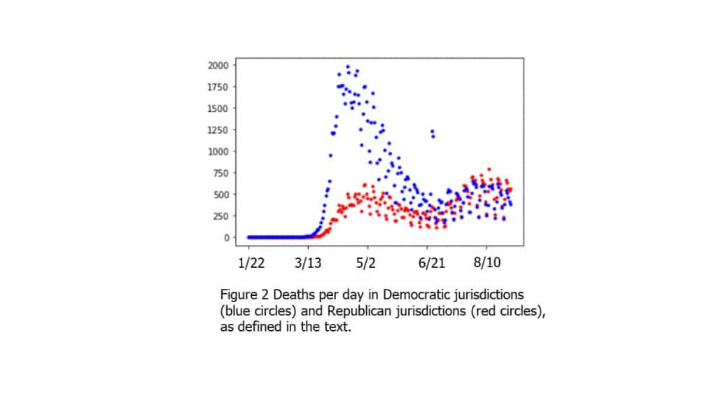
In an attempt to get somewhat closer to partisan political leadership and its influence on COVID-19 mortality, I have performed a second calculation. In this case, I have taken a majority of Trump or Clinton voters in a given county to indicate “local political control (RL/DL).” Further, I have included the political party of the governor of the given state to indicate “state political control (RS/DS).”
If a county has local Republican control (RC) and state Republican control (RS), all of the deaths in the county are assumed to be the fault of Republicans. Likewise for DL and DS, all deaths are assumed to be due to Democrats. For split counties (e.g. Republican governor but the county voted for Clinton) half the deaths go in the Republican and half in the Democrat column.
The results, shown in figure 2, are the number of deaths per day weighted by the political control of the county. Here the data indicate that an even larger percentage of deaths in the first wave were in democratic-controlled jurisdictions. The second wave is far more evenly distributed, however, and even has a slight bias toward Republican-controlled states and counties.
The total numbers of deaths, in this case, are approximately 122,000 under Democrats’ control and 58,000 under Republicans’ control.
A Ghastly Sideshow
The numbers show clearly that roughly 18,000 more Clinton voters have died from the pandemic than Trump voters. While this is interesting to quantify it is not particularly surprising given the epidemiology and underlying demographic factors.
The question lurking at the back of the COVID-19 discussion, and made explicit by Rubin’s columns (to say nothing of various Hollywood cranks who claim that Trump has killed more than 185,000 Americans) is who is responsible for those deaths? The simple calculation of figure 1 does not answer that question and figure 2 only suggests an answer.
In Rubin’s original thesis, she posited that Republican governors and local officials, through their denial of the gravity of the pandemic, were behaving “recklessly” and that the abundant Trump supporters in those places were going to pay the price.
Stripped of the snarkiness and Trump obsession, and, generously, conceding to Rubin that what she really meant was the number of COVID-19 deaths going forward after the entry points and coastal urban density were discounted, Rubin’s argument is one of policy and it is entirely reasonable.
It is wrong. But it is reasonable.
Everyone is trying to figure out the right balance between opening the economy and reducing the incidence of disease. At its simplest, Rubin’s argument is just a call for greater caution and slower opening.
But it is also a bad faith argument, as she fails to even acknowledge that far more dominant epidemiological factors (New York City subways, for example) are at play.
My personal view, and this may be heterodox, is that everyone—from Donald Trump to Governors Gavin Newsom (Calif.), Brian Kemp (Ga.) and Andrew Cuomo (N.Y.) and many others in between—is doing his best in an unprecedented crisis. They all deserve to be cut some slack. What constitutes an “adult conversation” about the pandemic, and Lord knows we need one, is a recognition of this fact—a recognition that motivations are, for the most part, not sinister and that in 21stcentury America, appreciable competency exists in our executive offices for analyzing and countering pandemics like this one.
But reflexive and, as this data shows, preposterously wrong claims—like Rubin’s—about expected Republican/Democratic mortality stemming from an obsession with Trump’s historically unique maladies is nothing more than a ghastly sideshow—one that, alas, we feel compelled to watch.
Still, we can hope for the brighter day when a future lethal, terrifying, and utterly nonideological threat to our nation is met with bipartisan comity and the collaboration of all. Now that is wishful thinking!